

Buffet Cabinet with Hutch Pantry Storage
WHITE
$7,213.99
Sale price
$7,213.99
Regular price
$0.00
Skip to product information



Buffet Cabinet with Hutch Pantry Storage
$7,213.99
Sale price
$7,213.99
Regular price
$0.00
SPECIFICATIONS
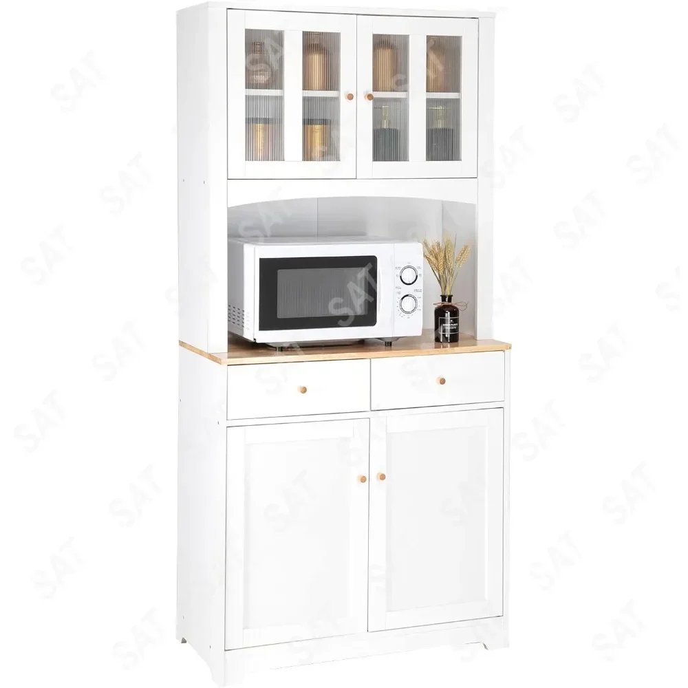
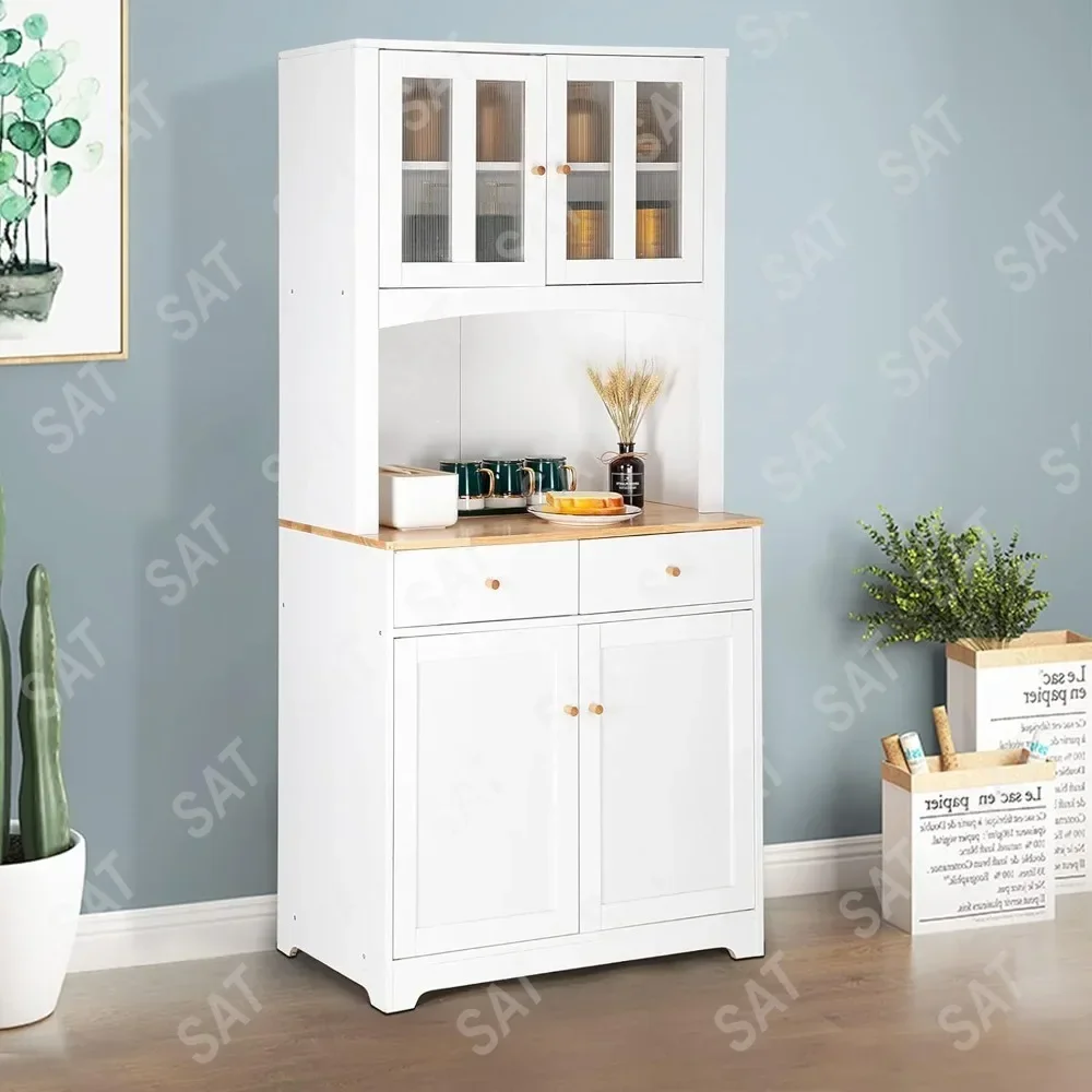
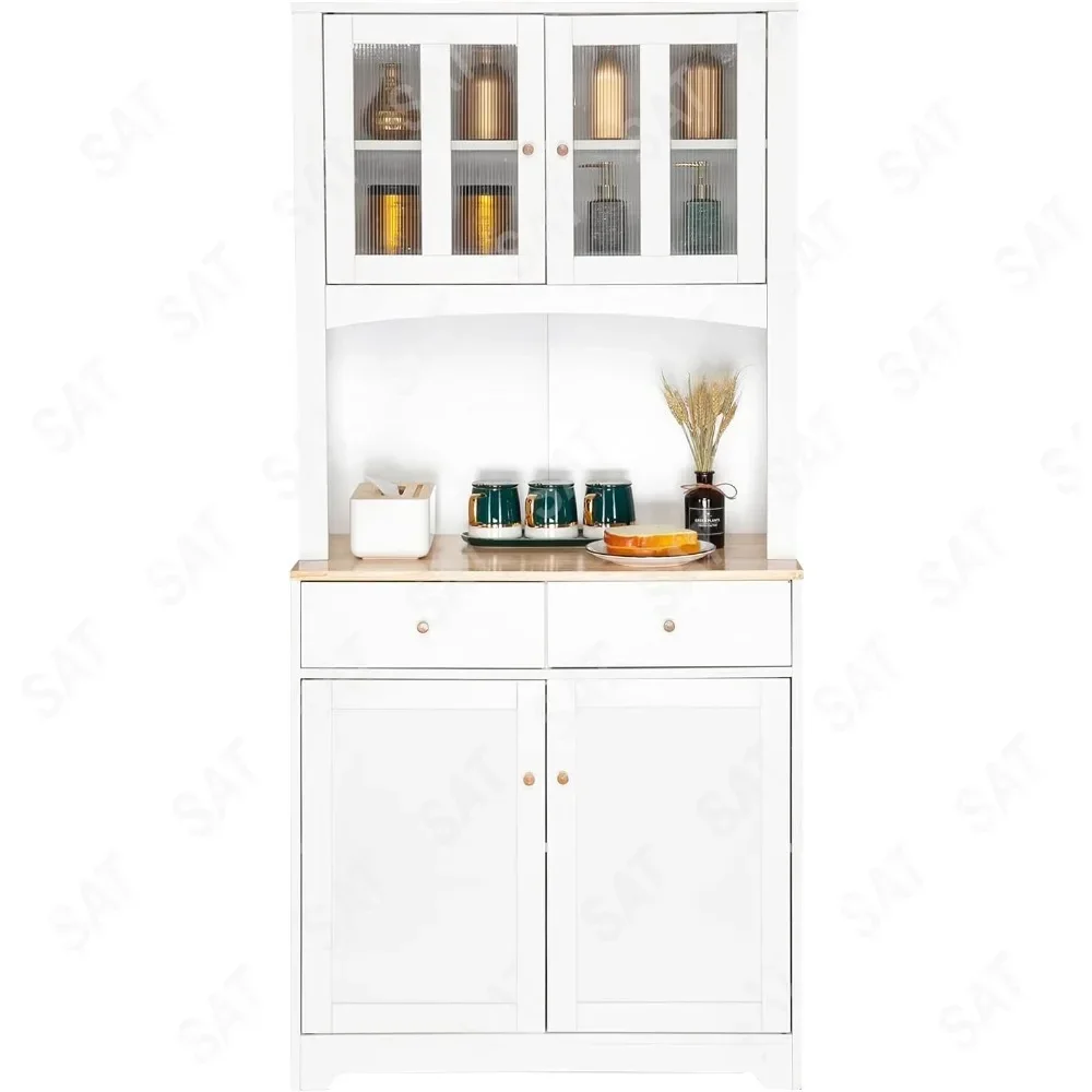
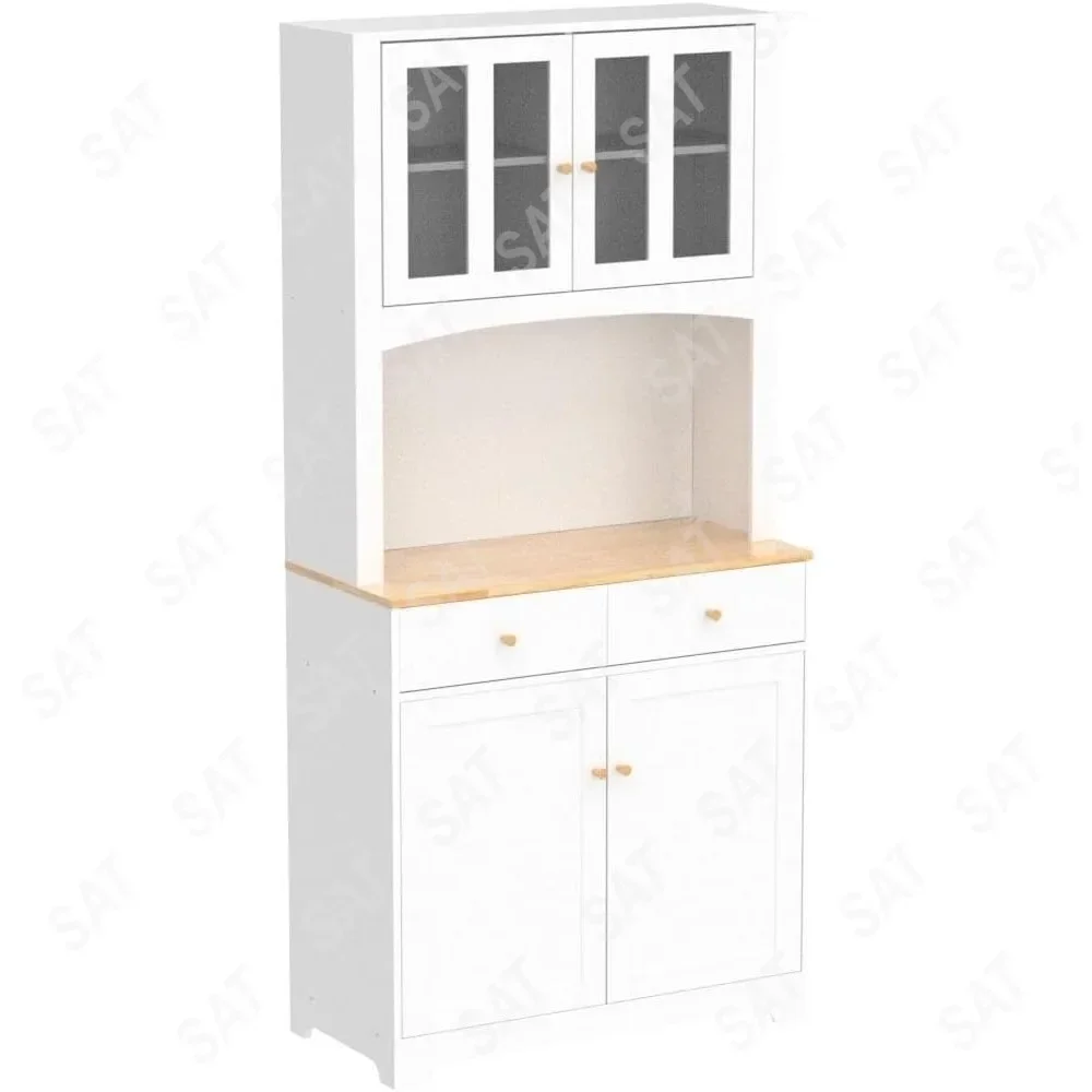
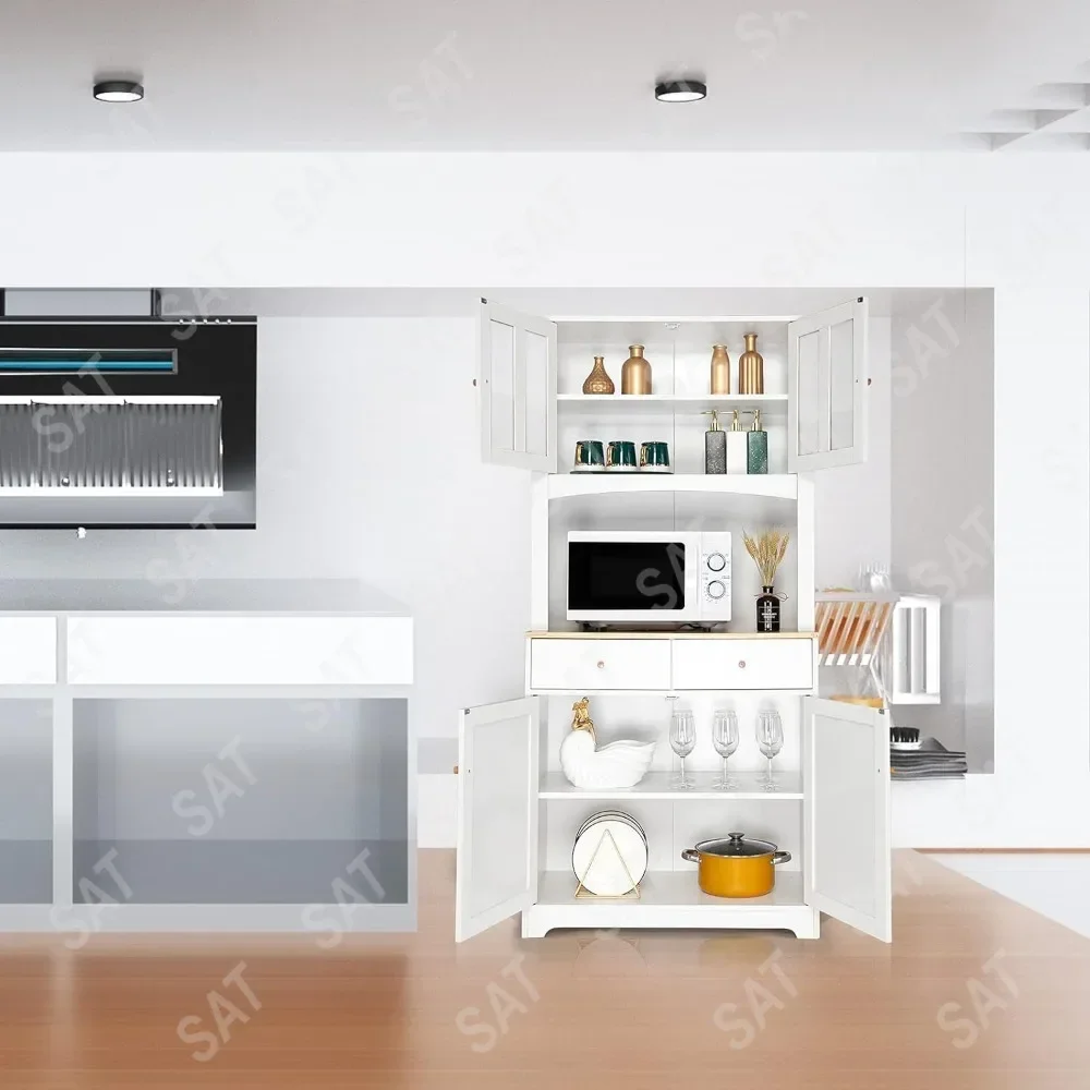
Buffet Cabinet with Hutch Pantry Storage White Sideboard for Microwave Storage, 4 Doors, 2 Adjustable Shelves High quality
Carcase Material: Solid Wood
Installation Method: Assembly
Material: Solid Wood Boards
Size: 4m
Type: Kitchen Cabinets
优雅的厨房储藏室 - 这款白色储藏室橱柜采用经典外观设计,线条简洁,表面光滑,可轻松融入您家中的任何装饰.
大储物空间 - 配备 2 个带门的橱柜和可调节搁板,可满足您不同的储物需求.中间有一个开放式搁板,用于放置微波炉或咖啡机等家用电器.它有足够的高度和一个补丁孔.
多功能 - 这款带小屋的餐边柜非常适合厨房,购买也可用于食品储藏室,壁橱,卧室,甚至在车库中作为储物柜使用.
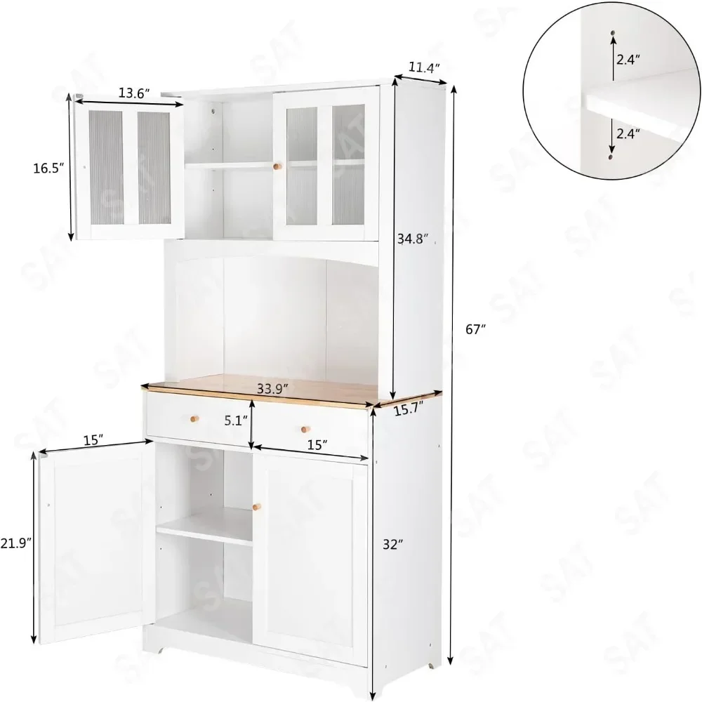
高品质 - 这款橱柜由优质 P2 MDF 板和实木桌面制成,非常稳定耐用. 它需要组装. 我们有易于阅读的说明手册,每个板和硬件都标有包装中. 整体尺寸:33.9"W x 15.7"D x 67"H

.aplus-v2 .aplus-review-right-padding {
padding-right: 0.1rem;
}.aplus-v2 .aplus-review-right-padding {
padding-right: 0.1rem;
}.aplus-v2 .aplus-review-right-padding {
padding-right: 0.1rem;
}.aplus-v2 .aplus-review-right-padding {
padding-right: 0.1rem;
}.aplus-v2 .aplus-review-right-padding {
padding-right: 0.1rem;
}.aplus-v2 .aplus-review-right-padding {
padding-right: 0.1rem;
}.aplus-v2 .apm-brand-story-carousel-container {
position: relative;
}
.aplus-v2 .apm-brand-story-carousel-hero-container,
.aplus-v2 .apm-brand-story-carousel-hero-container > div {
position: absolute;
width: 100%;
}/*
Ensuring the carousel takes only the space it needs.
The sizes need to be set again on the absolutely positioned elements so they can take up space.
*/
.aplus-v2 .apm-brand-story-carousel-container,
.aplus-v2 .apm-brand-story-carousel-hero-container {
height: 625px;
width: 100%;
max-width: 1464px;
margin-left: auto;
margin-right: auto;
overflow: hidden;
}
/*
This centers the carousel vertically on top of the hero image container and after the logo area (125px).
Margin-top = (heroHeight - cardHeight - logoAreaHeight) / 2 + logoAreaHeight
*/
.aplus-v2 .apm-brand-story-carousel .a-carousel-row-inner{
margin-top: 149px;
}
/*
Cards need to have a width set, otherwise they default to 50px or so.
All cards must have the same width. The carousel will resize itself so all cards take the width of the largest card.
The left margin is for leaving a space between each card.
*/
.aplus-v2 .apm-brand-story-carousel .a-carousel-card {
width: 362px;
margin-left: 30px !important;
}
/* styling the navigation buttons so they are taller, flush with the sides, and have a clean white background */
.aplus-v2 .apm-brand-story-carousel .a-carousel-col.a-carousel-left,
.aplus-v2 .apm-brand-story-carousel .a-carousel-col.a-carousel-right {
padding: 0px;
}
.aplus-v2 .apm-brand-story-carousel .a-carousel-col.a-carousel-left .a-button-image,
.aplus-v2 .apm-brand-story-carousel .a-carousel-col.a-carousel-right .a-button-image {
border: none;
margin: 0px;
}
.aplus-v2 .apm-brand-story-carousel .a-carousel-col.a-carousel-left .a-button-image .a-button-inner,
.aplus-v2 .apm-brand-story-carousel .a-carousel-col.a-carousel-right .a-button-image .a-button-inner {
background: #fff;
padding: 20px 6px;
}
.aplus-v2 .apm-brand-story-carousel .a-carousel-col.a-carousel-left .a-button-image .a-button-inner {
border-radius: 0px 4px 4px 0px;
}
.aplus-v2 .apm-brand-story-carousel .a-carousel-col.a-carousel-right .a-button-image .a-button-inner {
border-radius: 4px 0px 0px 4px;
}
padding-right: 0.1rem;
}.aplus-v2 .aplus-review-right-padding {
padding-right: 0.1rem;
}.aplus-v2 .aplus-review-right-padding {
padding-right: 0.1rem;
}.aplus-v2 .aplus-review-right-padding {
padding-right: 0.1rem;
}.aplus-v2 .aplus-review-right-padding {
padding-right: 0.1rem;
}.aplus-v2 .aplus-review-right-padding {
padding-right: 0.1rem;
}.aplus-v2 .apm-brand-story-carousel-container {
position: relative;
}
.aplus-v2 .apm-brand-story-carousel-hero-container,
.aplus-v2 .apm-brand-story-carousel-hero-container > div {
position: absolute;
width: 100%;
}/*
Ensuring the carousel takes only the space it needs.
The sizes need to be set again on the absolutely positioned elements so they can take up space.
*/
.aplus-v2 .apm-brand-story-carousel-container,
.aplus-v2 .apm-brand-story-carousel-hero-container {
height: 625px;
width: 100%;
max-width: 1464px;
margin-left: auto;
margin-right: auto;
overflow: hidden;
}
/*
This centers the carousel vertically on top of the hero image container and after the logo area (125px).
Margin-top = (heroHeight - cardHeight - logoAreaHeight) / 2 + logoAreaHeight
*/
.aplus-v2 .apm-brand-story-carousel .a-carousel-row-inner{
margin-top: 149px;
}
/*
Cards need to have a width set, otherwise they default to 50px or so.
All cards must have the same width. The carousel will resize itself so all cards take the width of the largest card.
The left margin is for leaving a space between each card.
*/
.aplus-v2 .apm-brand-story-carousel .a-carousel-card {
width: 362px;
margin-left: 30px !important;
}
/* styling the navigation buttons so they are taller, flush with the sides, and have a clean white background */
.aplus-v2 .apm-brand-story-carousel .a-carousel-col.a-carousel-left,
.aplus-v2 .apm-brand-story-carousel .a-carousel-col.a-carousel-right {
padding: 0px;
}
.aplus-v2 .apm-brand-story-carousel .a-carousel-col.a-carousel-left .a-button-image,
.aplus-v2 .apm-brand-story-carousel .a-carousel-col.a-carousel-right .a-button-image {
border: none;
margin: 0px;
}
.aplus-v2 .apm-brand-story-carousel .a-carousel-col.a-carousel-left .a-button-image .a-button-inner,
.aplus-v2 .apm-brand-story-carousel .a-carousel-col.a-carousel-right .a-button-image .a-button-inner {
background: #fff;
padding: 20px 6px;
}
.aplus-v2 .apm-brand-story-carousel .a-carousel-col.a-carousel-left .a-button-image .a-button-inner {
border-radius: 0px 4px 4px 0px;
}
.aplus-v2 .apm-brand-story-carousel .a-carousel-col.a-carousel-right .a-button-image .a-button-inner {
border-radius: 4px 0px 0px 4px;
}